
It's no secret the nonprofit world often lags behind the private sector when it comes to technology. Here's one way to keep your organization ahead of the curve.
As you know by now, responsive design is the approach to building a website that takes into account the fact that emails and webpages are now viewed on a wide variety of differently-sized screens. There are many ways you can design your website to accommodate visitors on different devices.
At minimum, sites are considered "mobile-optimized" if they deliver a formatting result that is specific only to mobile devices. This is usually where you see m.site.org, site.org/mobile, or otherwise altered URLs that redirect the user to a different version of the site when it detects a mobile device.
A website design might be called "mobile-friendly" if it doesn't have too many images, which slow down page load times, or Flash-enabled animations, which frequently do not render on mobile screens. Mobile-friendly sites also have larger call-to-action buttons that work equally well on desktop screens as they do on mobile touchscreens. In addition, they often feature well-spaced links to help the user avoid accidentally clicking the wrong link.
But what sets true responsive design apart is not what it leaves out. The most important thing about responsive design is the user experience. A great user experience (UX) not only enhances the overall web browsing experience, it can actually improve donor loyalty.
So whether your prospective donor's device of choice is a laptop, mobile phone, desktop computer, tablet, or anything in between, they will get a consistent, easily-navigable experience that's specifically tailored to the design and functionality of whichever gadget they use to access their email and/or web browser.
This is because responsively-designed websites don't call attention to themselves. There is no clunky horizontal navigation, no hard-to-read font, no slow page refresh times, no limited access, no perplexing layout. Just an intuitive, fast, full-functionality browsing (and giving) experience.
If you implement responsive design on your nonprofit organization's website, visitors to will benefit from a smoother, friction- and frustration-free experience without ever realizing why.
Here are just a few examples of responsive design done right.
Microsoft
Desktop:

Mobile:

Courtesy of mobify
Nokia
Desktop:

Mobile:

Courtesy of mobify
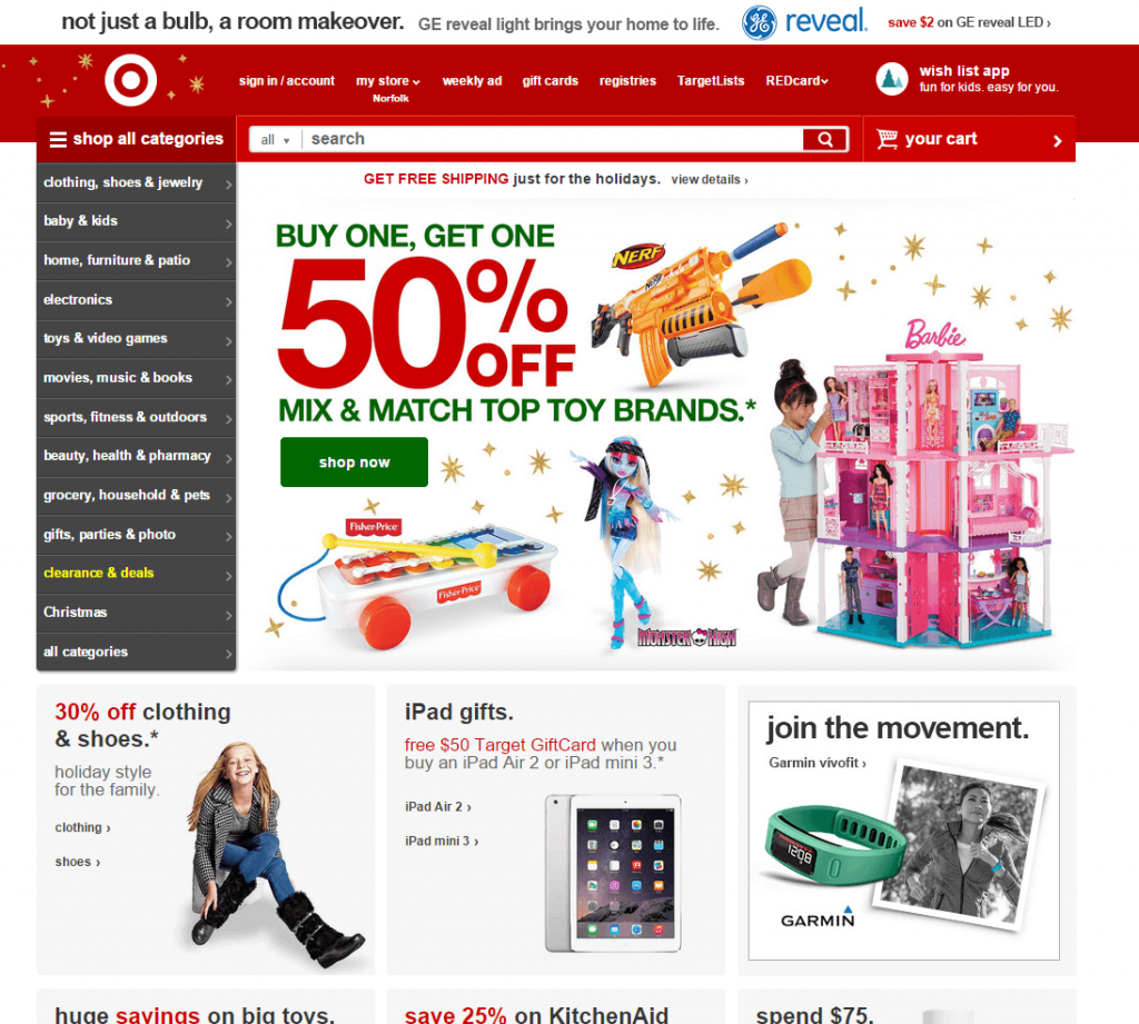
Target
Desktop:
Mobile:

StratusLIVE
(What? You didn't think we'd neglect to take our own advice, did you?)
Desktop:


Mobile:

What type of website does your nonprofit organization currently have? What do you envision for your website in the future?

